The Power of Colours
Share
Colours have a significant impact on our mood and emotions. Different colours can evoke various psychological and physiological responses, influencing our feelings, behaviour, and overall well-being. While colour preferences can be subjective and vary among individuals and cultures, there are general associations and effects that colours have on our mood. Here are some common colour effects:
-
Red: Red is often associated with strong emotions like passion, love, and anger. It can increase heart rate and blood pressure, creating a sense of excitement and urgency. It can also stimulate appetite and grab attention, which is why it's frequently used in advertising.
-
Blue: Blue is known for its calming and soothing effect on the mind and body. It is associated with serenity, tranquility, and stability. Blue has been shown to lower blood pressure and heart rate, making it an ideal colour for relaxation and stress reduction.
-
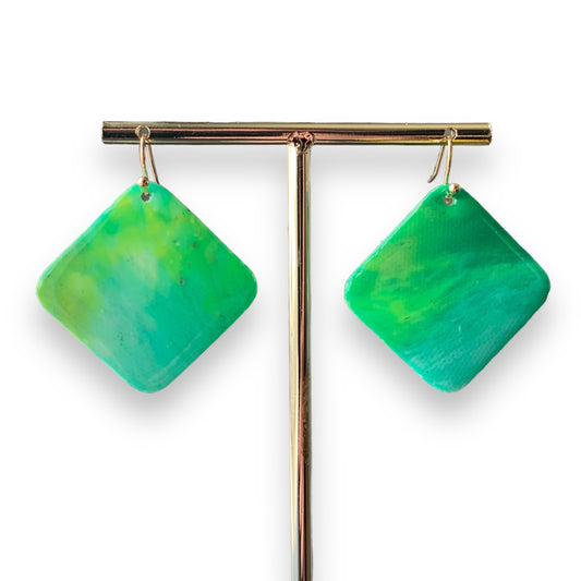
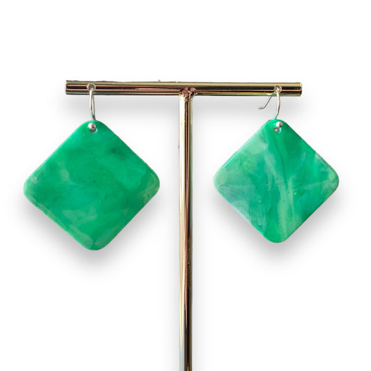
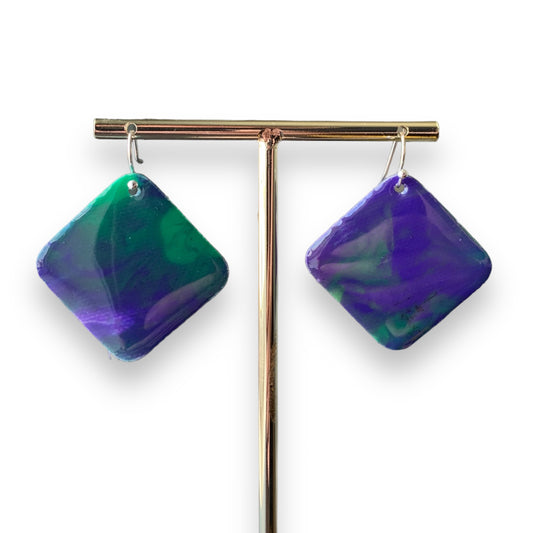
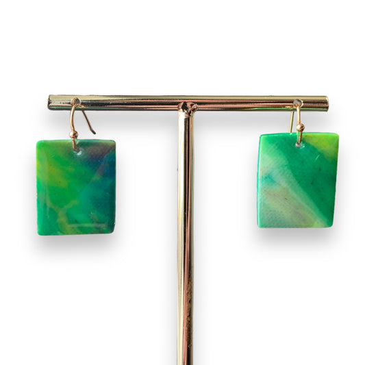
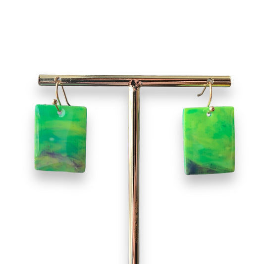
Green: Green is often linked to nature and has a refreshing and harmonising effect. It represents growth, renewal, and balance. Green is known to promote feelings of calmness, harmony, and relaxation, making it beneficial for reducing anxiety and promoting concentration.
-
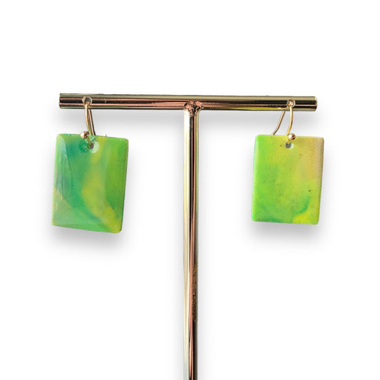
Yellow: Yellow is a vibrant colour that is associated with happiness, energy, and optimism. It can evoke feelings of joy and cheerfulness, as well as stimulate mental activity and creativity. However, excessive yellow can lead to feelings of frustration or anxiety, so it is best used in moderation.
-
Orange: Orange combines the energy of red and the warmth of yellow. It is often associated with enthusiasm, creativity, and sociability. Orange can evoke feelings of excitement and encourage social interaction. It can also stimulate appetite, which is why it's commonly used in restaurants.
-
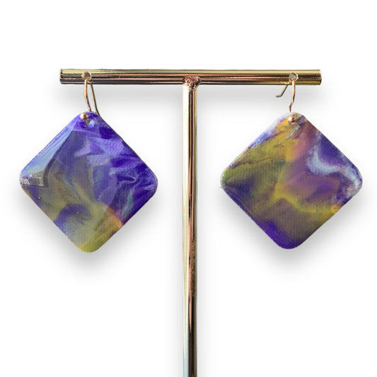
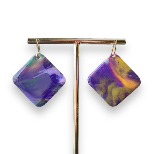
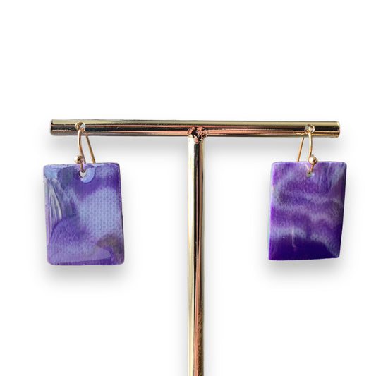
Purple: Purple is associated with luxury, spirituality, and creativity. It can have a calming effect on the mind and promote a sense of balance and introspection. Darker shades of purple can be associated with royalty and power, while lighter shades may have a more romantic and nostalgic feel.
-
Pink: Pink is often associated with femininity, gentleness, and nurturing. It has a calming effect and can evoke feelings of love, warmth, and compassion. Pink is known to reduce aggression and create a sense of relaxation.
It's important to note that individual experiences and cultural backgrounds can influence how colours impact mood. Personal preferences and associations can also play a role in how we respond to different colours. Additionally, context and combinations of colours can affect their overall impact on mood.
Artists use colour in various ways to convey emotions, create visual impact, and communicate messages. Here are some common techniques and strategies artists employ when working with colour:
-
Expressing Emotions: Artists often use colour to express and evoke specific emotions. Warm colours like red, orange, and yellow can convey energy, passion, and happiness, while cool colours like blue and green can evoke calmness, serenity, and sadness. Artists may choose colours based on the mood or atmosphere they want to create in their artwork.
-
Symbolism and Meaning: Colours can carry symbolic meanings and cultural associations. Artists may use colours symbolically to convey ideas or concepts. For example, red can represent love or danger, while white can symbolise purity or innocence. By incorporating symbolic colours, artists add layers of meaning to their artwork.
-
Colour Harmony and Contrast: Artists pay attention to colour harmony and contrast to create visually pleasing compositions. They may use complementary colours (opposite colours on the colour wheel) to create contrast and make elements stand out. Analogous colours (colours next to each other on the colour wheel) are often used to create harmonious and unified palettes.
-
Focal Points and Visual Hierarchy: Artists use colour to direct the viewer's attention and create focal points within their artwork. By using bright or contrasting colours, artists can make certain areas stand out and guide the viewer's gaze. They may also use colour intensity or size variations to create a visual hierarchy and emphasise important elements.
-
Mood and Atmosphere: Colours can significantly influence the mood and atmosphere of a piece of art. Artists carefully select colour schemes to set the desired mood. For example, a painting with predominantly warm colours may evoke a sense of energy and excitement, while a painting with cool colours may create a tranquil and peaceful atmosphere.
-
Narrative and Storytelling: Colour can be used to enhance storytelling in art. Artists may employ colour to depict different times of day, seasons, or specific environments. By using specific colour palettes, they can create a particular narrative or evoke a specific setting, enhancing the overall storytelling in their artwork.
-
Personal Expression and Style: Artists develop their own colour preferences and unique styles over time. They may experiment with unconventional colour combinations or use colours in unexpected ways to express their individuality and create a distinctive visual language. Artists' personal choices and interpretations of colour contribute to the diversity and richness of artistic expression.
Overall, colour is a powerful tool in an artist's arsenal, allowing them to convey emotions, create visual impact, and add depth and meaning to their artwork.